Multi-Service Dashboards: Watching Dozens of Endpoints Without Drowning in Noise
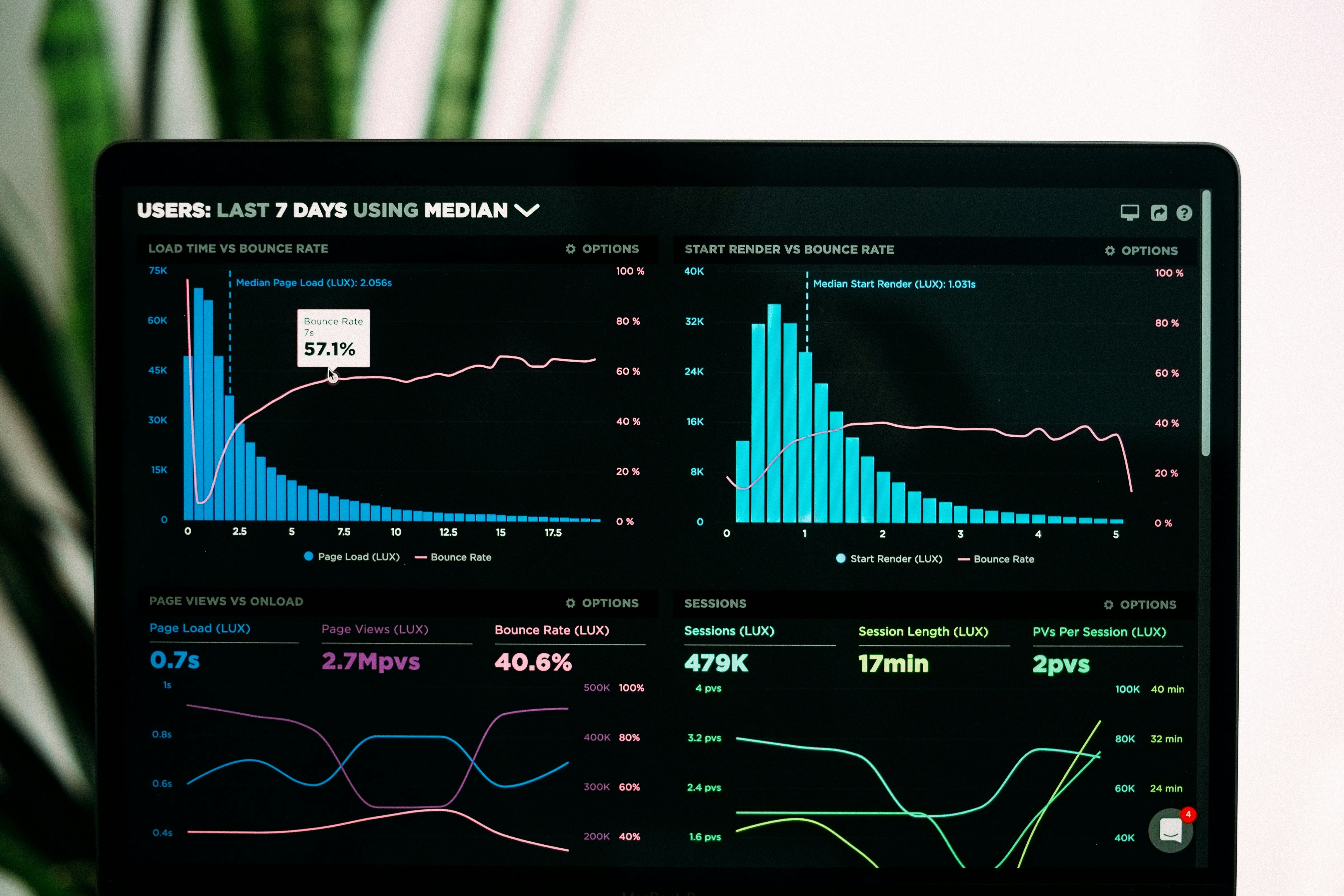
Monitoring one service is easy — a single dashboard, a single alert channel, and you always know exactly what's being watched. Monitoring thirty services is a different problem entirely. Past a certain point, adding more monitored endpoints to the same undifferentiated list doesn't add visibility — it buries the signal you actually need under status indicators for things that don't matter right now.
Why Dashboards Degrade as You Scale
A dashboard that worked fine with five services often stops working well around fifteen or twenty, for a few predictable reasons:
- Everything looks equally important — a critical production API sits next to a rarely-used internal tool with the same visual weight
- Green becomes the default assumption — with enough services, people stop actively scanning and just glance for red, which means slow degradations get missed
- No grouping reflects how the team actually thinks about the system — a flat list doesn't match the mental model of "customer-facing" vs. "internal" or "team A's services" vs. "team B's"
Group by What Actually Matters, Not Alphabetically
The most useful dashboards are organized around a real distinction — usually one of:
- Criticality — customer-facing production services separated from internal or staging tools
- Team ownership — grouped by whoever's actually responsible for responding
- Product area — grouped by the part of the product a failure would affect
Whichever grouping you choose, the goal is the same: someone glancing at the dashboard should immediately know which section deserves their attention first.
Not Every Service Needs the Same Visibility
A common mistake is treating every monitored endpoint as equally worth a permanent spot on the main view. A more scalable approach: keep a small set of genuinely critical services on the primary dashboard, and let everything else live one click away, surfaced only when something's actually wrong. This keeps the main view scannable in seconds instead of requiring someone to parse forty rows to find the one that matters.
Let Alerting Do the Filtering, Not the Dashboard
A dashboard is a pull system — someone has to go look at it. Alerting is a push system — it comes to you. As the number of monitored services grows, lean more heavily on well-tuned alerts to surface problems, and treat the dashboard as a place to go for context and history rather than the primary way incidents get noticed. A dashboard nobody's actively watching at 2am doesn't help; a well-routed alert does.
Watch for Correlated Failures
At scale, a single upstream issue — a shared database, a network provider, a DNS problem — can cause several services to fail at once. Without grouping or context, this can look like a dozen unrelated incidents instead of one root cause, which sends a team investigating in a dozen different directions simultaneously. Structuring your dashboard by dependency or infrastructure grouping, not just by individual service, makes correlated failures obvious instead of confusing.
Multi-Service Monitoring With TwoPulse
TwoPulse's dashboard is built to stay usable as your list of monitored services grows — group services, see uptime and latency at a glance, and drill into any individual service's check history without losing the overview. Because alerting is configured independently per service in TwoPulse, you can keep sensitive, fast-routing alerts on your handful of critical services while dialing back noise on everything else, so the dashboard reflects what actually matters rather than an undifferentiated wall of green checkmarks.
Frequently Asked Questions
At what point should I start grouping my monitored services?
There's no fixed number, but most teams start feeling the need somewhere between ten and twenty services, when scanning the full list stops being a quick glance.
Should every service be on the main dashboard view?
Not necessarily. Keeping only genuinely critical services on the primary view, with everything else accessible but not front-and-center, generally keeps the dashboard more useful.
How do I know if my current dashboard setup has become too noisy?
A practical test: ask someone unfamiliar with the system to find the most critical service's status in under five seconds. If they can't, the layout needs regrouping.
Should alerting or the dashboard be my primary way of noticing incidents?
Alerting, generally — a dashboard requires someone to actively look at it, while a well-tuned alert reaches the right person without anyone needing to be watching in real time.
How do I catch correlated failures across multiple services?
Grouping services by shared infrastructure or dependency, rather than just alphabetically, makes it much easier to spot when several failures share one root cause.
Managing more services than you can comfortably scan? Get started with TwoPulse and organize your dashboard around what actually matters — or log in to regroup your existing services.
---